Flipping the script
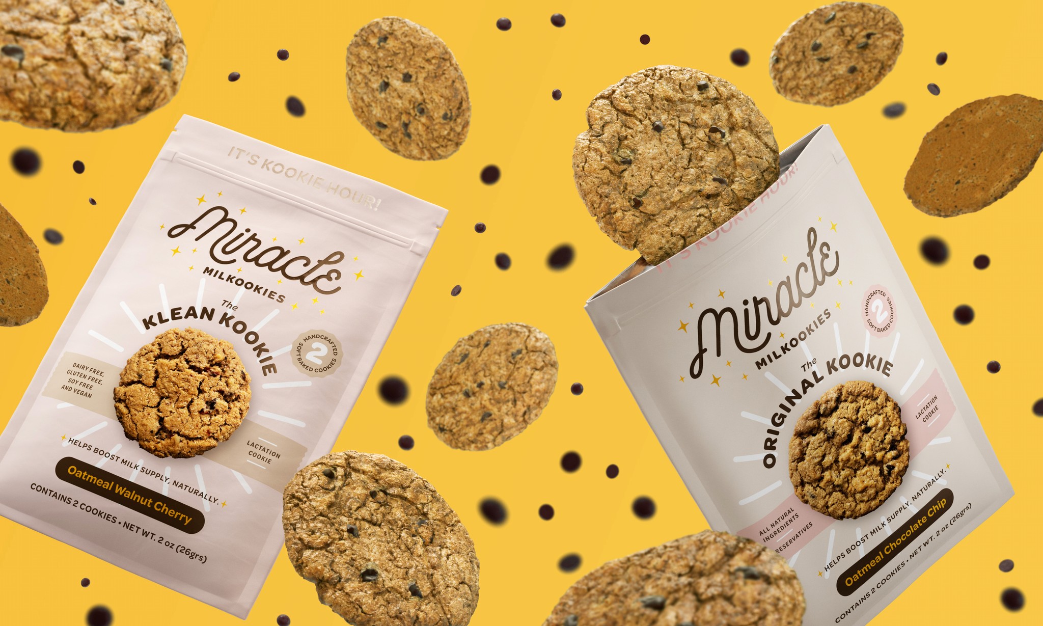
We needed to maintain a modern, sophisticated logo that would signal authority when partnering with larger organizations and retailers while capturing the nurturing authenticity and friendliness of the mothers who Miracle Milkookies serves. The refreshed logo contains a modern script font that conveys a friendly yet sophisticated personality. We extended this visual identity into the packaging using soft and rich colors that radiate warmth and positivity.


Comforting and supportive inside and out
This Miracle Milkookies pouch design radiates the brand's essence: nurturing, sincere, and handcrafted. By blending retro-modern aesthetics with comforting colors and thoughtful details, we’ve crafted a packaging design that feels like a warm, friendly embrace—a timeless companion for new moms needing a wholesome, supportive treat.


